Foram anunciados os vencedores do Prémio Obra do ano (ODA ’17)
De entre 15 finalistas; 2 projectos Brasileiros e 4 portugueses foram selecionados através da reportagem fotográfica de Fernando Guerra. O primeiro lugar foi ganho pelo projecto – Casa na Mata / Studiomk27 – Marcio Kogan + Samana Cafardo
“No ArchDaily, o site de arquitetura mais visitado do mundo, não acreditamos que júris de “especialistas” sejam necessários para definir uma arquitetura de qualidade. Os profissionais globais que compõem nossa rede de leitores são os verdadeiros jurados do nosso Prêmio Obra do Ano, em sua primeira edição no ArchDaily Brasil. Entre mais de mil projetos, nossos leitores selecionaram a melhor arquitetura produzida nos países lusófonos. Estes arquitetos e estudantes de diversas partes do mundo escolheram os três edifícios que – devido à sua estética, inteligência, criatividade ou serviço à comunidade – representam a melhor arquitetura do ano.
Este ano o ArchDaily Brasil fez parceria com a Saint Gobain para lançar esse prêmio para a comunidade de arquitetura. Aqui anunciamos os vencedores do Prêmio Obra do Ano de 2017, escolhido pelos votos de mais de 20.000 pessoas de todos os países de língua portuguesa, desde o dia 13 de Março.
Após uma semana intensa de nomeações, que serviu para selecionar os 15 finalistas do Prêmio Obra do Ano 2017, com projetos do Brasil, Portugal e Angola – dentre os quais estava a MR&MRS White Store, de Paulo Merlini arquitetos, a Casa Mipibu, de Terra e Tuma, a Casa das duas vigas de Yuri Vital, Sede do Campo Olímpico de Golfe de RUA Arquitetos, Sede do Centro Equestre da Fazenda Boa Vista de Isay Weinfeld, Escola na Vila Nova da Barquinha de Aires Mateus, os Passadiços do Paiva de Trimetrica, o Centro Sócio-Cultural da Costa Nova do ARX PORTUGAL, o Pombal do AZO. Sequeira Arquitectos Associados, o Museu da Moeda de Costa Lopes em Angola, a Casa Restelo de João Tiago Aguiar e a Ladeira da Barroquinha, de Metro Arquitetos Associados – a premiação passou à etapa de votação a partir da qual os três premiados foram selecionados a partir da inteligência coletiva de nossos leitores”. Os vencedores da primeira edição do Prêmio Obra do Ano do ArchDaily Brasil, são:
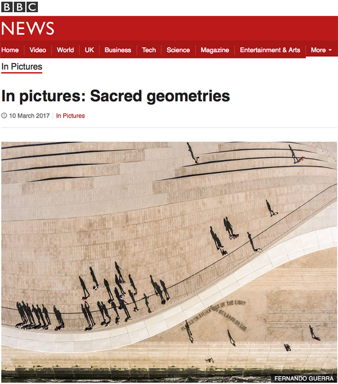
“A small group of photographers have turned their lenses on the urban landscape, seeking to capture the beauty of the architecture around us. The images explore the idea of sacred geometries, the perfect mix of proportion and mathematical ratios that are pleasing to the eye and a reflection of those found in nature.
The pictures can be seen at the Anise Gallery in London until 15 April 2017”
“Geometric diagrams can be contemplated as still moments revealing a continuous, timeless, universal action generally hidden from our sensory perception”
– Robert Lawlor
Inspired by trends in contemporary photography and the diverse writings of Plato, author Robert Lawlor and architectural historian Peg Rawes, Anise Gallery is marking its fifth birthday with an exhibition of photography based on themes found in the sacred geometries.
Geometry in aesthetics are unavoidable when traversing through the city, whether this is in grand scale such as skyscraper architecture, to the tiny backs of ladybirds. Intricate design can be located in both complex, constructed design patterns and in the minute details in nature. Aesthetics and mathematics come together in geometry, and have done since ancient Egypt, where geometrics were viewed as a visual manifestation of law and order. Later in ancient Greece, they had sacred and scientific properties in helping to solve earthly mysteries.
Into the twenty-first century, we find ourselves in a world inundated with images, through social media, the press, search engines and the like. how are the world’s most sophisticated geometries best captured? Evidently, sacred geometries have value beyond that of the aesthetic, and are viewed as the coming together of mathematics, nature and spirituality, due to their use in religious iconography.
‘Sacred Geometry’ has various levels of complexity, from the sphere to the flower of life, each with their own significance in fields such as religious and mathematics. However, once these designs enter the realm of art and reproduction, they risk losing their aesthetic power and meaning, as products of the artist’s ideas instead of being autonomous. Does photography change this? The attraction to photography has always been its ability to depict its subject matter true-to-life; yet in a world of post-production and filters, aesthetic manipulation and embellishment are now prevalent in contemporary art, and ‘Sacred Geometries’ looks at how the two might come together, here in the polarising environments of nature and the metropolis.
Whereas Lawlor focuses on sacred geometry’s ancient powers and mystique, architectural historian Peg Rawes has adapted these ideas into more contemporary ideas, incorporating the following elements: the reflective subject, folds, passages, plenums, envelopes and horizons. From an architectural point of view, this allows the transition from ancient symbolism to contemporary urban landscapes.
Through the curation of an exhibition of film from Paul Raftery and Dan Lowe, and photography by Dennis Gilbert, Doublespace, Fernando Guerra, Hufton and Crow, Jim Stephenson and John MacLean, Anise Gallery hope to inspire and instigate a conversation surrounding Sacred Geometries. In collaboration with Miniclick an evening of short talks and discussion will take place on 6th Arpil.
Fernando Guerra, one of the world’s most in-demand architectural photographers, talks to David Clark about his life and work.
When Fernando Guerra started working as an architectural photographer in the late 1990s, it wasn’t a popular genre. Influenced by Magnum photographers, Fernando brought a more photojournalistic approach to shooting buildings.
Instead of simply taking record shots, he photographed them in a more dynamic and creative way, focusing on how the buildings are used and who uses them. He helped make architectural photography cool and is now one of its most popular practitioners. Fernando’s commissions regularly take him on travels to different parts of his native Portugal and to many other countries around the world. He’s a busy man, but we managed to catch up with him during a few days’ break between shoots in Portugal and Brazil…
Read the full interview at the PhotoPlus, The Canon Magazine
Vencedores do Prémio ArchDaily Building of the Year 2017
Foram anunciados os vencedores do Prémio ArchDaily Building of the Year de 2017 e dentro das 14 categorias premiadas, 2 projectos portugueses foram escolhidos por mais de 75.000 leitores entre 3.500 projectos publicados durante todo o ano de 2016.
Entre os 4 finalistas portugueses, 2 projectos foram seleccionados através da reportagem fotográfica de Fernando Guerra, sendo o único fotógrafo com 2 projectos vencedores em distintas categorias:
Habitação:
Casa Cabo de Vila
spaceworkers
Arquitectura Pública:
Leixões Cruise Terminal
Luís Pedro Silva Arquitecto
It was announced the winners of the Prize ArchDaily Building of the Year 2017 and in the 14 award categories, 2 Portuguese projects were chosen by more than 75.000 readers among 3.500 projects published throughout 2016.
Among the 4 Portuguese finalists, 2 projects were selected from photographic reports of Fernando Guerra, the only photographer with two winning projects in different categories:
Houses:
Casa Cabo de Vila
spaceworkers
Public Architecture:
Leixões Cruise Terminal
Luís Pedro Silva Arquitecto
Era para ter sido uma entrevista programada, cheia de ideias, baseada na 1919 Collection da Porsche Design, mas o caminho previsto foi minado logo no início. Porque, sem qualquer abordagem prévia, o nosso convidado começou a revelar-se e a conversa fluiu não apenas sobre os dois relógios que o desafiámos a experienciar. Muito pelo contrário. Longe do incontornável e premiado fotógrafo de arquitetura que Fernando Guerra é, conhecemos um verdadeiro entusiasta de relógios de pulso. Um apaixonado também. Quanto aos novos Porsche Design, gostou da experiência, sem dúvida, e chegou mesmo a aventurar-se com algumas fotografias. Mas não esconde que continua a vibrar mais por outro perfil de instrumentos do tempo.
Por Cesarina Sousa
Fernando Guerra
Um dos perigos de abordar personalidades de renome é o inevitável risco de entrar em modo loop, perante o que já foi escrito ou que já foi dito. E, quando se pesquisa «Fernando Guerra» pelos meandros da Internet, há quase sempre algo de comum a muitas histórias: começou a fotografar cedo, aos 16 anos, e nunca mais parou. Com o curso de Arquitetura, optou por seguir um rumo especializado — uniu hobby e formação para apostar na fotografia de arquitetura, numa altura em que esta área era ainda pouco explorada por cá. Para se ter uma noção concreta do trabalho que este fotógrafo tem desenvolvido, o ideal é uma visita ao site oficial da empresa que criou com o seu irmão há cerca de 17 anos. Para aqui, arriscamos apenas salientar que existe um antes e um depois de Fernando Guerra no âmbito do seu domínio profissional. Isto porque o português, nascido em Lisboa, arriscou deixar de lado a abordagem fotográfica vazia da arquitetura para revelar a vida que cada obra tem. Tenta, como o próprio nos disse, «contar uma história, fazer uma pequena narrativa; se estou a fotografar uma casa, o mais interessante é apanhar todos os que ali vivem e interagem a todas as horas do dia: porque, nesse momento, aquela enorme casa que estive a fotografar torna-se numa espécie de relógio no qual as pessoas são como que a engrenagem que dá sentido ao edifício.» E, assim, saímos do modo loop, já que a referência aos relógios não é fruto do acaso. Porque o que a Internet não diz é que, antes da fotografia e mesmo antes da sua paixão por automóveis Porsche, Fernando Guerra comprou sozinho o seu primeiro relógio — não um relógio de pulso, de estilo questionável e de cores bem marcadas, como era apanágio dos anos 80, mas um relógio de bolso que o tem acompanhado desde sempre: tinha 13 anos.
On the 1919 Collection (and other stories …)
It was to be a scheduled interview, full of ideas, based on the 1919 Porsche Design Collection, but early on we strayed off track. Because without prior notice, our guest began to open up and the conversation flowed, and not only about the two watches we challenged him to try on. Quite the opposite. Far from the inescapable and award-winning architectural photographer that is Fernando Guerra, we became acquainted with a true wristwatch enthusiast. A passionate one, too. As for the new Porsche Design, there’s no doubt he enjoyed the experience, and even went so far as to venture to take some photographs. But he doesn’t hide the fact that it is another kind of timekeeper that continues to resonate more with him.
By Cesarina Sousa
Fernando Guerra
One of the dangers of approaching renowned personalities is the inevitable risk of going into loop mode, faced with what has already been written or said. And when searching for “Fernando Guerra” through the meanders of the Internet, many of the stories almost always have a common thread: he started taking pictures early at the age of 16 and never stopped. With a degree in architecture, he chose to follow a specialized path – uniting a hobby and a degree to focus on architectural photography at a time when this area remained largely unexplored in Portugal. To get a concrete idea of the work this photographer has developed, the best thing to do is to visit to the official website of the company that he created with his brother about 17 years ago. Here we will simply point out that there is a before and after Fernando Guerra in his professional domain. This is because the Lisbon-born Portuguese photographer ventured to leave aside the empty photographic approach to architecture in order to reveal the life within each structure. He tries, as he himself told us, “to tell a story, to create a short narrative; If I am shooting a house, the most interesting thing is to capture all those who live and interact there at all hours of the day: because at that moment, that huge house that I’ve been shooting becomes a kind of watch in which people are like the gears that give sense to the building”. And in this way we exit loop mode, since the reference to watches isn’t by chance. Because what the Internet does not say is that prior to photography and even before his passion for Porsche cars, Fernando Guerra bought himself his first watch – not a wristwatch of dubious style and well-marked colours as was the style in the ‘80s, but a pocket watch that has been with him ever since: he was 13 years old.
Entusiasta, apreciador, colecionador?
Não vale a pena procurar um adjetivo para qualificar a relação que Fernando Guerra tem vindo a construir, desde então, com os relógios — principalmente relógios de pulso. Se alguém pensava que iríamos descobrir uma coleção recheada de marcas imponentes de alta-relojoaria, desengane-se. Para termos uma ideia, no momento da entrevista, o nosso convidado estava entusiasmadíssimo com um cronógrafo GMT Ikepod Hemipode de 2003 — que, pouco tempo depois, acabou mesmo por adquirir e aceitava o desafio de fazer algumas fotografias para a Oris. No entanto, o fotógrafo confessou que vibra com a procura de relógios vintage, em especial da década de 70: «Com os relógios, tenho a mesma política que tenho com os carros: começo por adquirir os mais difíceis e, depois, passo para os mais acessíveis. Neste momento, estou a tentar adquirir relógios que, por exemplo, gostaria de ter quando era mais novo e não podia. Por outro lado, tal como os carros, ter só por ter (guardados) não me interessa. Adoro ter, para usufruir deles.» No seguimento da conversa, Fernando Guerra revelou-se apreciador e entusiasta, mas não só. «Quando arrisco mostrar os meus relógios, muitos talvez questionam as minhas escolhas, por vezes, pouco consensuais face ao que é suposto ser obrigatório adquirir. Mas o que me leva a escolher é muito mais. Quem gosta de máquinas gosta delas por tudo. Na minha perspetiva, o valor de um relógio não é defendido só pela marca, pelos materiais, pelo preço ou pelo movimento. Para mim, existe uma alma dentro do relógio, algo que me chama, e o incrível é perceber essa alma. Existem relógios que parecem ter histórias para nos contar. E compro-os por isso. Depois, claro, há o impulso. O momento.» Por tudo isto, não se considera um colecionador. Não há um critério específico de coleção associado às suas aquisições. Entusiasta? Sim. E vício? «Acho que sim», referiu a sorrir. Aqui vale a pena acrescentar um aspeto: Fernando Guerra nunca sai de casa sem um relógio no pulso: «é a única joia que gosto de usar; além disso, como tempo é aquilo que não tenho na minha vida, acabo por ter uma relação muito especial com estes objetos.»
Perfil de relógio
Tal como um edifício, um relógio tem também uma estrutura. Eleva-se e surge enquanto peça arquitetural com inúmeros detalhes para descobrir e comunicar — razões mais do que suficientes para introduzir o tema da arquitetura. Um fotógrafo de arquitetura que também é arquiteto teria, com certeza, um gosto óbvio no que diz respeito a relógios de pulso. Pensávamos nós, claro. «Julgo que a maioria dos meus colegas tende a usar relógios tipo estação dos comboios suíça. Muito minimal. Isso é o cliché de relógio de arquiteto», destacou Fernando Guerra. Com efeito, há uma tendência para estes profissionais apreciarem relógios mais clean, mais leves esteticamente. Só que não é o caso do nosso convidado: «de um modo geral, tenho queda para relógios com algumas complicações, robustos, com aspeto maciço, gosto de os sentir. Quando estava a trabalhar em Macau como arquiteto, a minha revista preferida era a National Geographic, e, nessa altura, a Rolex publicava uns anúncios maravilhosos que mostravam exploradores e fotógrafos no alto de montanhas, pessoas em esforço, com um relógio no pulso. Aqueles anúncios causavam impacto. Faziam sonhar. E esse foi um dos motivos pelos quais sempre quis ter um Rolex: o espírito de aventura que esses anúncios transmitiam. Não sou um explorador, mas a minha vida é intensa e imprevisível. Ando 365 dias de botas, constantemente em trânsito — tanto posso estar num sítio tropical sem problemas, como no dia seguinte estar enterrado até aos joelhos a fotografar outra coisa qualquer. Quando compro relógios, têm de ser peças que desligo que as tenho, que sejam resistentes, com as quais possa andar sempre.»
Enthusiast, aficionado, collector?
It’s not worth trying to find an adjective to qualify the relationship Fernando Guerra has built with watches since then – mostly wristwatches. If anyone thinks we were going to discover a collection full of must-have brands, think again. To get an idea, at the time of the interview our guest was thrilled with a 2003 Ikepod Hemipode GMT chronograph – which, shortly thereafter, he ended up acquiring – and accepted the challenge of taking some pictures for Oris. Yet the photographer confessed that he gets a buzz hunting for vintage watches, especially from the ‘70s: “With watches I have the same policy as I have with cars: I start by acquiring the most difficult ones and then move on to the more accessible. Right now, I’m trying to acquire watches I’d like to have had when I was younger but couldn’t. On the other hand, just like cars, having them just to keep them (stored away) does not interest me. I love having them in order to enjoy them.” During the conversation, Fernando Guerra revealed himself not only to be an aficionado and enthusiast, but more. “When I dare show my watches, many might question my choices, which are sometimes unorthodox in relation to what is supposedly de rigueur. But what leads me to choose a certain watch is much more. Those who like gadgets like them as a whole. In my view, the value of a watch is not only its brand, materials, price or movement. For me, there is a soul inside the watch, something that calls to me, and the incredible thing is to understand that soul. There are watches that seem to have stories to tell us. And I buy them for that. Then, of course, there is the urge. The moment. For all that, he doesn’t consider himself a collector. There is no specific collection criterion associated with his acquisitions. Enthusiast? Yes. Addict? “I think so,” he said, smiling. It’s worth adding: Fernando Guerra never leaves home without a wristwatch: “It’s the only jewellery I like to wear; Besides, since time is something that I don’t have in my life, I end up having a very special relationship with these objects.”
Watch profile
Just like a building, a watch also has a structure. It rises and soars as an architectural piece with countless details to discover and communicate – more than enough reasons to introduce the subject of architecture. An architectural photographer who is also an architect would certainly have a clear taste for wristwatches. Or so we thought, of course. “I think most of my colleagues tend to wear Swiss train station type watches. Very minimal. That is the cliché of an architect’s watch”, Fernando Guerra stressed. Indeed, there is a tendency for these professionals to appreciate more aesthetically light, clean watches. But this is not the case for our guest: “in general, I fall for watches with some complications, robust, with a massive appearance. I like to feel them. When I was working in Macao as an architect, my favourite magazine was National Geographic, and at that time Rolex published wonderful ads that featured explorers and photographers on mountain tops, people exerting themselves with a watch on their wrist. Those ads had an impact. They made me dream. And that was one of the reasons why I always wanted to have a Rolex: the spirit of adventure that these ads conveyed. I am not an explorer, but my life is intense and unpredictable. I walk 365 days in boots, constantly in transit – I can just as easily be in a tropical location without a care in the world, or the next day be buried up to my knees photographing something else. When I buy watches, they have to be pieces that I’m not aware of when I’m wearing them, that are resistant, that I can wear at all times.”
Porsche Design 1919 Collection
Perante este perfil de relógio, voltámos a cair em terreno pantanoso. Convidámos a experienciar dois Porsche Design 1919 (really?). Inspirada nas linhas do Porsche 356 e ancorada na linguagem minimalista e funcional associada à escola Bauhaus, a linha 1919 é uma construção vanguardista e difere do design integrado que, na década de 70, estabeleceu as fundações da relojoaria moderna. O Globetimer apresenta um ponteiro suplementar para a indicação de um segundo fuso horário no mostrador, com a indicação das cidades representativas de todos os 24 fusos, e o Chronotimer integra um movimento cronográfico, com consequente adaptação da caixa (com botões de forma) e do mostrador (numa disposição tricompax vertical). Falamos de relógios com caixas de 42 mm, cujas caraterísticas fazem deles pouco dotados para aventura. São relógios Porsche Design e ponto final. Caixa em titânio (logo, leve) com asas estilizadas, não integradas, linhas puras, mostradores minimais — relógios que encaixavam mais no perfil de arquiteto que esboçámos de início. Quanto muito, tínhamos a ligação ao mundo Porsche — Fernando Guerra é, atualmente, embaixador do novo Porsche Panamera, e essa foi a razão pela qual o convidámos a testar relógios Porsche Design. Isso e a associação à arquitetura, claro. Mas não foi grave: «prefiro relógios robustos, mas tal não me impede de apreciar peças realmente bonitas. E, acima de tudo, sinto um prazer imenso em ver um objeto bem desenhado no pulso.» O nosso convidado aceitou, assim, o desafio. Não só experienciar, como também fotografar os dois Porsche Design já referidos.
O que o levou a aceitar o nosso convite?
A 1919 Collection tem a sua graça e um dos aspetos que me levou a encarar este desafio com entusiasmo foi a ligação à Porsche — mesmo que a Porsche Design não desenvolva relógios para a Porsche. Mas, se inicialmente fui levado a tentar encontrar nos relógios elementos que tivessem a ver com a Porsche, depois optei por mudar essa abordagem, porque estava a ser levado a procurar relações que visualmente não são assim tão óbvias. Claro que há sempre elementos como o rotor de alto rendimento no fundo, há também detalhes como a coroa com ranhuras ou o mostrador do Chronotimer, mas a inspiração Porsche 356 é difícil de descortinar a olho nu por mais que me falem em linhas. Mais do que um Porsche, consigo relacionar os relógios com quase qualquer carro, desde que seja um carro bem desenhado, claro. Agora, consigo ver, sem dúvida, um relógio que me dá imenso gozo usar porque é muito bonito e segue uma linha muito própria — muito purista. A mim agrada-me que a Porsche Design esteja a construir uma identidade diferente que foge do caminho seguido por outras marcas — e, nisso, posso dizer que há, sem dúvida, relação com a marca Porsche.
Porsche Design 1919 Collection
Confronted with this watch profile, we fell back into muddy waters. We invited him to experience two Porsche Design 1919 timepieces (really?). Inspired by the lines of the Porsche 356 and anchored in the minimalist and functional language associated with the Bauhaus school, the 1919 line is an avant-garde construction, differing from the integrated design that established the foundations of modern watchmaking in the 1970s. The Globetimer has an extra hand to indicate a second time zone on the dial, with an indication of representative cities from all 24 zones, while the Chronotimer integrates a chronograph movement with a subsequent adaptation of the case (with stylized push buttons) and hand (in a vertical tri-compax arrangement). We talk about watches with 42 mm cases, whose characteristics make them poorly suited for adventure. They are Porsche Design watches, full stop. Titanium cases (thus light) with non-integrated stylized lugs, pure lines, minimal dials – watches that better fit the profile of architect that we sketched in the beginning. At the very least, we shared a connection to the world of Porsche – Fernando Guerra is currently ambassador for the new Porsche Panamera, and that’s why we invited him to test Porsche Design watches. That and the association with architecture, of course. But it wasn’t hugely important: “I prefer sturdy watches, but that does not stop me from appreciating really beautiful pieces. Above all, I take great pleasure in looking at a well-designed object on my wrist.” So our guest accepted the challenge. Not just to experience, but also to photograph the two Porsche Design pieces already mentioned. We leave you with his impressions of this experience, as well as some photos that came out of it. PART TWO The Porsche Design 1919 Collection Experience
What prompted you to accept our invitation?
The 1919 Collection is fun and one of the aspects that led me to face this challenge enthusiastically was its link to Porsche – even if Porsche Design does not develop watches for Porsche. But if I was initially led to try to find elements of the watches that had to do with Porsche, I later chose to change that approach because I was looking for relationships that are visually not so obvious. Of course, there are always elements like the high-performance rotor in the background, or details like the grooved crown or the Chronotimer dial, but inspiration from the Porsche 356 is difficult to spot with the naked eye no matter how much you talk to me about design. Rather than a Porsche, I can associate watches with almost any car, as long as it’s a well-designed car, of course. Now without a doubt I can identify a watch that gives me immense joy to wear because it’s very beautiful and follows its own unique style – very purist. I am pleased that Porsche Design is building a different identity that takes a different path from other brands – and I can say that in this there is undoubtedly a connection with the Porsche brand.
E o que o cativou mais nos dois relógios?
Quando me lançaram o desafio, optei pelo Globetimer Series 1 Titanium & Rubber porque passo a vida a viajar. No entanto, quando vi o Chronotimer Titanium & Rubber, adorei. Ontem, estava a jantar, e, quando dei por mim, estava distraído a olhar para o relógio a descobrir imensos pormenores. E por ter andado um mês com o Globetimer e agora menos com este, acabei por olhar com atenção e descobrir que gosto de muita coisa. Se formos para detalhes, posso dizer, por exemplo, que não me lembro de, recentemente, ter visto um mostrador tão bonito, neste misto de linhas puras, mas com um toque um pouco sporty que lhe dá uma identidade especial. Além disso, gosto do desenho e da estrutura. As asas funcionam quase como um caminho para chegar até à caixa, como se fossem um pedestal que a eleva, e isto sai daquilo que está estabelecido como desenho. Na maior parte dos relógios, não há este espaço nas asas, há uma continuidade entre caixa e bracelete. No caso dos 1919, as asas abertas permitem destacar a caixa do relógio de uma forma que considero fora do normal — como se o relógio ficasse isolado. É engraçado, mas, neste aspeto, faz-me lembrar um relógio de bolso. Comparando, apesar de terem o mesmo diâmetro (42 mm), o Chronotimer acaba por parecer mais pequeno do que o Globetimer, e, tendo em conta o módulo cronográfico, como é mais alto também, acaba por me dar mais esse efeito.
Já vimos que não ficou indiferente ao Chronotimer Titanium & Rubber — se tivesse de salientar um só motivo que o levasse a adquirir este relógio, qual seria?
Além do preço relativamente acessível — que o torna um relógio bastante perigoso (!) —, tenho de referir o lado de não status, não ostensivo. E isso eu gosto muito. É um relógio que não grita, que não chama demasiado a atenção. Sinto-me muito confortável com um relógio destes no pulso. Já o tamanho parece ser o certo para o meu pulso. Digo isto, porque quando opto por relógios mais pequenos, de 40 ou 38 mm, acabo por recorrer a braceletes do tipo NATO que aumentam visualmente o perímetro por causa da fixação nas asas. O fundo transparente também lhe dá um toque especial — apesar de, como entusiasta de relógios, eu tenha tendência para vibrar mais com os aspetos estéticos do que mecânicos ou técnicos. O Globetimer não tem fundo aberto: apresenta no fundo indicação das cidades e respetivo fuso horário. Um complemento muito interessante para facilitar o acerto de um segundo fuso horário. Sinceramente, quando recebi o Chronotimer, e quando o agarrei, pensei logo que seria muito difícil de devolver. O que é muito bom. E hoje, quando o voltei a pôr no pulso, achei que realmente tudo tem que ver com proporção. Não tenho dúvidas de que estou a gostar muito deste relógio.
And what captivated you most about the two watches?
When I accepted the challenge, I opted for the Globetimer Series 1 All Black because I spend my life travelling. However, when I saw the Chronotimer Titanium & Rubber, I loved it. Yesterday, I was having dinner and I caught myself distractedly looking at the watch and discovering immense details. And because I’ve been wearing the Globetimer for a month now and less with this one, I’ve ended up looking closely at both and finding that there’s a lot I like. If we focus on details, I can say, for example, that I don’t remember recently having seen such a beautiful dial in this mix of pure lines but with a slightly sporty touch that gives it a special identity. I also like the design and structure. The lugs function almost like a path to the case, as if they were a pedestal elevating it, and that comes from the design itself. On most watches, the lugs have no such space, it’s solid between the case and bracelet. In the case of the 1919s, the open lugs highlight the watch case in a way I consider out of the ordinary – as if the watch were isolated. It’s funny, but in this respect, it reminds me of a pocket watch. In comparison, although they have the same diameter (42 mm), the Chronotimer ends up looking smaller than the Globetimer, and given that the chronograph module is also higher, in my view it creates that effect even more.
We’ve already seen that you’re not indifferent to the Chronotimer Titanium & Rubber – if you had to give one reason that would lead you to buy this watch, what would it be?
In addition to the slightly more affordable price – which makes it a rather dangerous watch (!) -, I have to mention its non-status, unostentatious side. And I like that a lot. It’s a watch that isn’t glaring, that doesn’t attract too much attention. I feel very comfortable with such a watch on my wrist. The size seems right for my wrist. I say this, because when I opt for smaller watches -40, 38 mm, I end up using NATO-type straps that visually increase the perimeter because of the lug fastenings. The transparent case back also gives it a special touch – although, as a watch enthusiast, I tend to go more for the aesthetic aspect rather than mechanical or technical. The Globetimer does not have an open case back: the case indicates the cities and their respective time zones. It’s a very interesting addition that facilitates setting a second time zone. Honestly, when I received the Chronotimer and took hold of it, I immediately thought it would be very difficult to hand back. Which is very good. And today, when I put it on my wrist again, I thought that everything really has to do with proportion. I have no doubts about liking this watch very much.
Aspetos a melhorar — alguma sugestão?
De um modo geral, ambos têm mostradores bastante claros e legíveis. Porém, no Globetimer, o contraste para leitura do segundo fuso horário poderia ser mais acentuado. O cinzento no preto acaba por sobressair pouco. Já no caso do Chronotimer, isso não acontece — todas as indicações se leem perfeitamente. Por outro lado, uma das primeiras coisas que gosto de experimentar fazer quando tenho um relógio novo é trocar a bracelete; com estes modelos, isso já não poderia acontecer tão facilmente pelo sistema que oferecem. Claro que este aspeto não é um ponto a melhorar, até porque em cada um deles a bracelete é muito confortável e, ao nível de integração nas asas, resulta mesmo bem. Queria só salientar que tive alguma dificuldade em habituar-me ao fecho — misto de fivela e báscula. Mas, com o tempo, lá me adaptei.
Durante o tempo que andou com os relógios, acabou por fotografá-los. Que tal o desafio?
O desafio de fotografar um relógio assemelha-se ao desafio de fotografar uma casa ou um carro. Muda a escala, mas a vontade de comunicar e de chegar à fotografia que conta a história da casa, mostra o desenho do carro ou um relógio é a mesma. Na minha relação com estes relógios, procurei sempre a fotografia que sintetizasse o que queria passar, mas acima de tudo guardar: numa relação também com o que sou como profissional e pessoa. Gosto de desafios e de ter diariamente problemas novos por resolver e que me levam a soluções novas que me fazem crescer como fotógrafo, sempre com uma máquina na mão num caminho que vou fazendo aprendendo a relacionar-me com escalas diferentes. Eu não faço as coisas em passagem. Da mesma maneira que descubro uma casa para fotografar, gosto de andar com um relógio durante uns meses e surpreender-me por pormenores de que gosto e nos quais nunca tinha reparado. Quando começo a usar um relógio, há uma paixão à primeira vista que depois vai crescendo: vou descobrindo diferentes ângulos de abordagem, as linhas, as proporções, os acabamentos, a incidência dos reflexos, algo que é semelhante com o que faço com a arquitetura. E são esses elementos que tento e tentei depois captar.
Things to improve – any suggestions?
In general, both watches have very clear and readable dials. However, on the Globetimer, the contrast could be more pronounced for reading the second time zone. Grey on black doesn’t stand out very much. In the case of the Chronotimer, this does not happen – all the indications are perfectly legible. On the other hand, one of the first things I like to try when I have a new watch is to change the bracelet; With these models, this couldn’t be done so easily given the system they have. Of course, this is not an aspect that needs improvement, especially because both the bracelets on both watches are very comfortable, and where the bracelets join the lugs, it works really well. I would just point out that I had some difficulty getting used to the combination pin buckle and folding clasp. But over time I adapted to it.
During the time you wore the watches, you ended up photographing them. How was that challenge?
The challenge of photographing a watch is similar to the challenge of photographing a house or a car. The scale changes, but the desire to communicate and to get a photograph to tell the story of the house, show the design of a car or a watch is the same. In my relationship with these watches, I always endeavoured to take a photo that synthesized what I wanted to pass on, but above all to preserve: also in relation to what I am as a professional and as a person. I like challenges and to have new problems to solve each day and that lead me to new solutions that make me grow as a photographer, always with a camera in my hand, on a path, learning to relate to different scales. I don’t do things in passing. In the same way that I discover a house to photograph, I like to walk around with a watch for a few months and be surprised by details of what I like and which I had never noticed before. When I start to use a watch, there is a passion at first glance that then keeps on growing: I discover different approach angles, lines, proportions, finishes, reflections, something that is similar to what I do with architecture. And it is these elements that I try (and have tried) to capture.
Exposição LUSÍADA 30 ANOS ARQUITETURA
Museu dos Coches, Sala Jardim de Belém
Organização: Universidade Lusíada de Lisboa
Comissários: Prof. Arq. Fernando Hipólito | Prof. Arq. Helena Botelho | Prof. Arq. Victor Neves
Esta exposição surge no âmbito das comemorações do 30.º aniversário da Universidade Lusíada de Lisboa, lugar de referência do Ensino Universitário em Portugal e tem como principal objetivo a revelação do património profissional e cultural, do qual este curso de Arquitectura foi agente.
Falar de representação em Arquitectura pode conduzir-nos à leitura dos modelos institucionalizados que periodicamente expõem e debatem os diferentes contextos da disciplina, como são exemplo as grandes bienais internacionais, que dão lugar a espaços expositivos que também lançam a questão de como representar Arquitectura. Não havendo a possibilidade de ler a Arquitectura através da vivência dos espaços construídos é, de facto, a partir de documentos que conhecemos as suas obras. Assim, representação pode também remeter-nos às diferentes linguagens que ao longo do tempo serviram como suporte para apresentar a Arquitectura, como o desenho, a maqueta, a fotografia e o vídeo. Parece-me oportuno falar da plataforma criada por Fernando Guerra e Sérgio Guerra, um trabalho de diálogo entre a arquitectura e a fotografia, situando-a em ambas as leituras aqui apresentadas desta temática.
Winners will be selected by some of the most interesting international architecture studios, along with journalists, entrepreneurs, designers and architectural photographers. Here are the first names:
-Brasilian architect Marcio Kogan, founder of mk27 studio; Israeli Pitsou Kedem, author of several important projects in Israel
-Benoit Jallon and Umberto Napolitano from LAN Architecture studio based in Paris; Spanish architect Fran Silvestre
-Mexican designer Hector Esrawe, founder of the Industrial Design degree at the Center for Design, Cinema and Television
-Portuguese architectural photographer Fernando Guerra, founder with his brother Sergio of FG+SG and ultimasreportagens.com
Últimas reportagens
recent work by Fernando Guerra
A mais completa biblioteca online de imagens da arquitectura contemporânea portuguesa. Últimos projectos nacionais. Obras de referência internacionais. Artigos especiais. Publicações. Visite-nos regularmente para novas imagens.
The most comprehensive online image library of contemporary portuguese architecture. The latest national projects. International reference works. Special articles. Publications. Visit us regularly for new images
Últimas Collins dictionary 1. last 2. latest, most recent; Latest is the superlative of late. adj You use latest to describe something that is the most recent thing of its kind. 3 adj You can use latest to describe something that is very new and modern and is better than older things of a similar kind.